Problem
Our mobile app architecture doesn't account for new features.
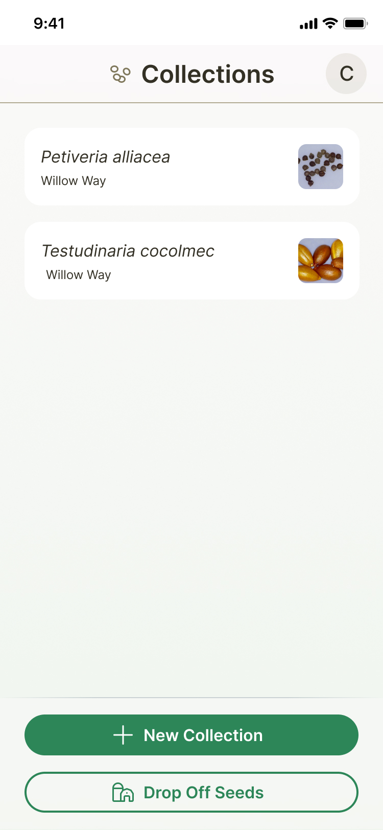
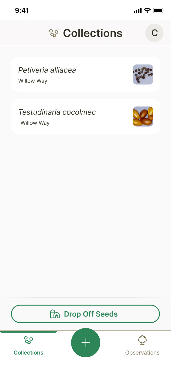
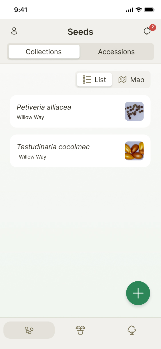
When the mobile app was created, it was with only one feature in mind: saving seed collection data. Since we were working on adding a new feature, we needed to rethink our app architecture so that it would account for multiple flows.
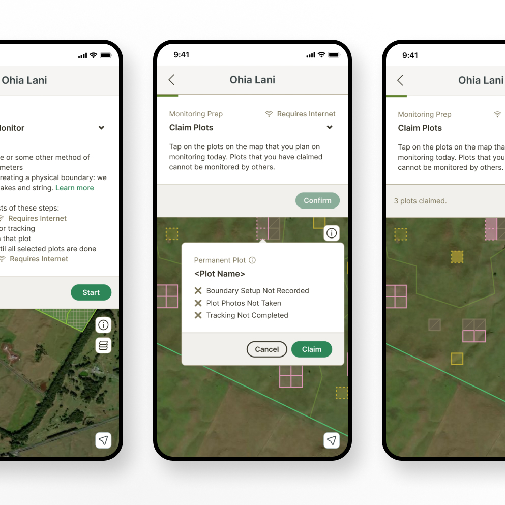
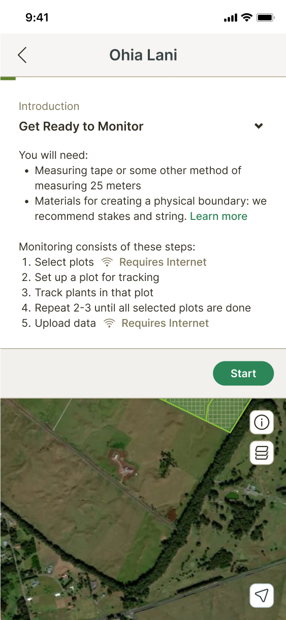
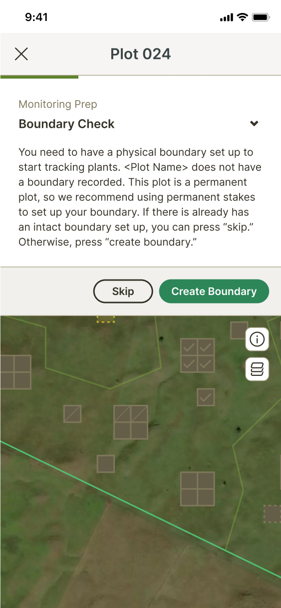
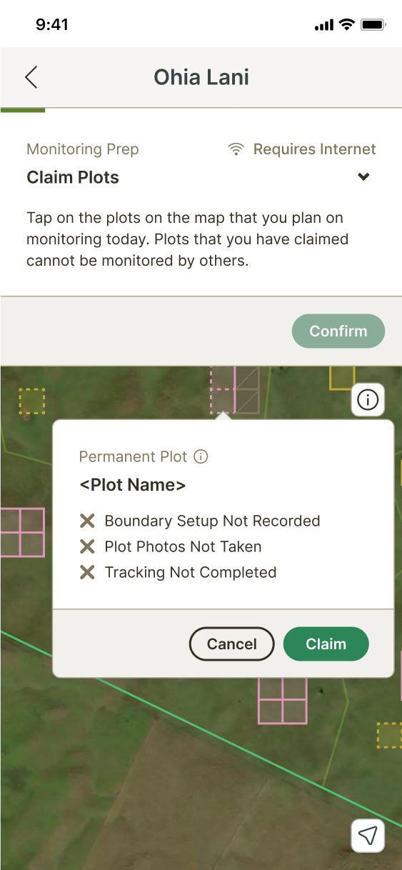
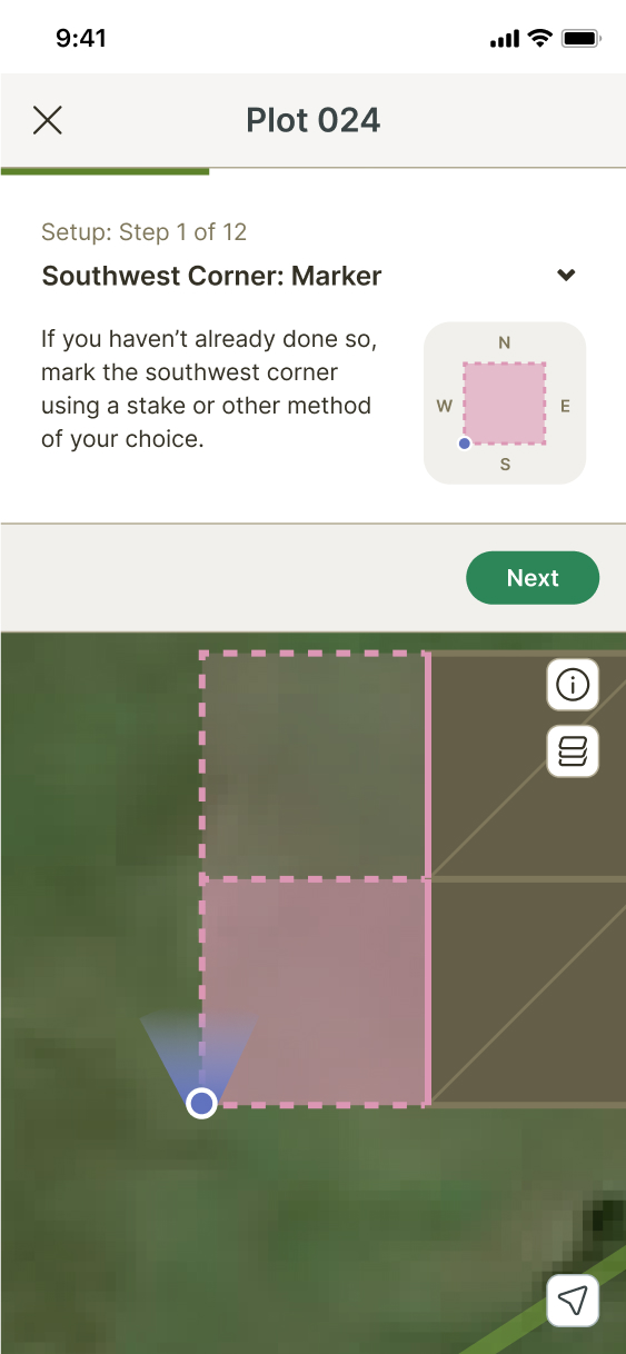
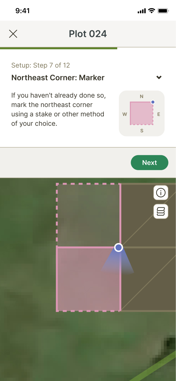
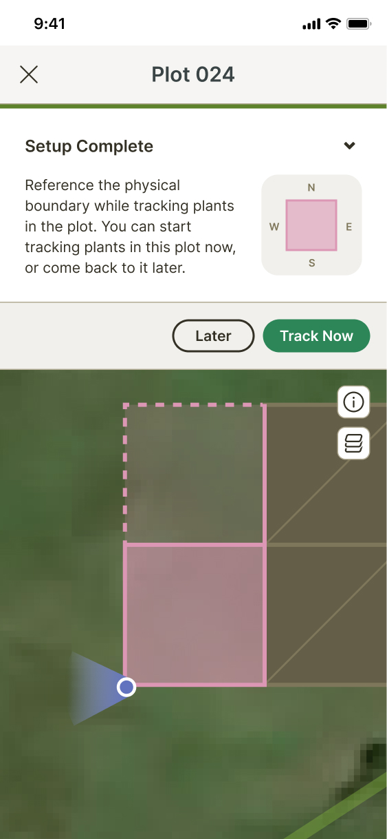
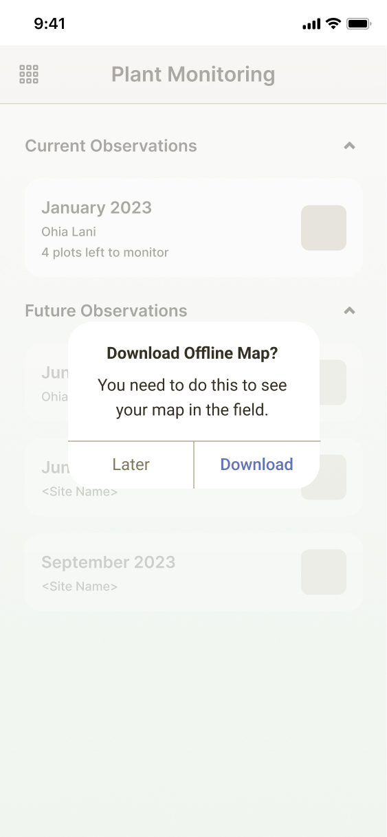
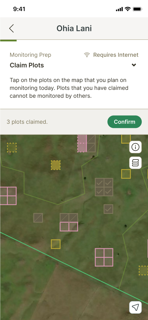
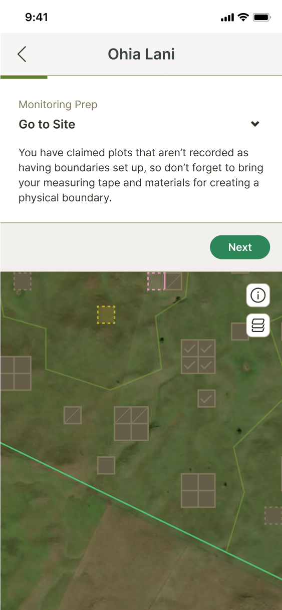
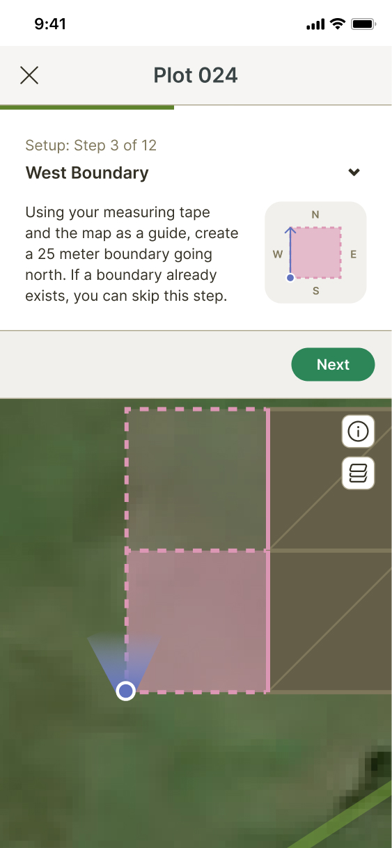
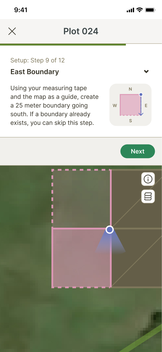
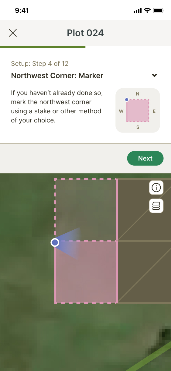
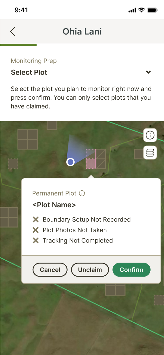
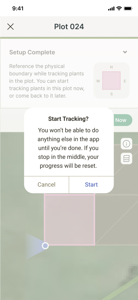
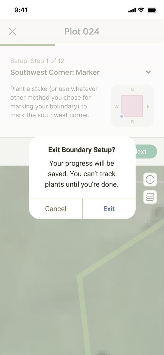
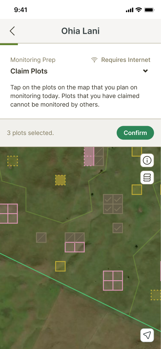
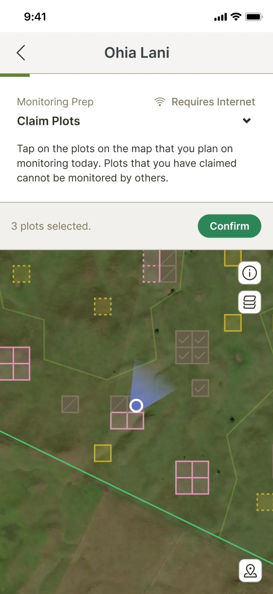
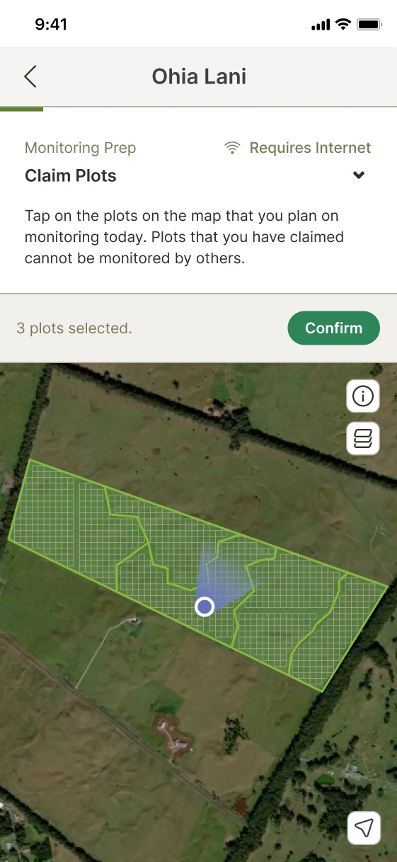
We need to instruct users to set up plots for plant monitoring in the field.
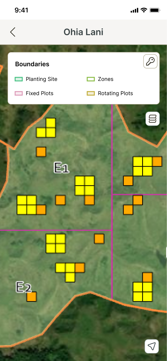
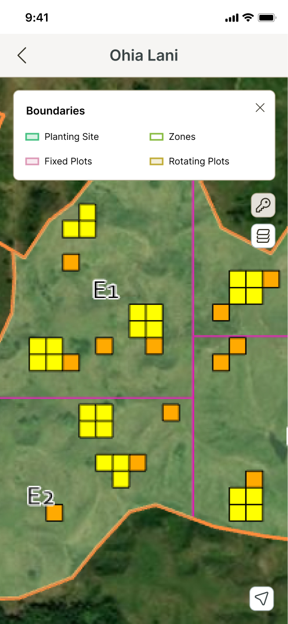
Due to the way our plant monitoring model worked, we needed to create a flow instructing users to create physical plot boundaries at specific, programmatically generated locations in their planting sites. This was the first mapping feature in our platform, so it introduced a lot of new interactions and UI patterns.
Solution
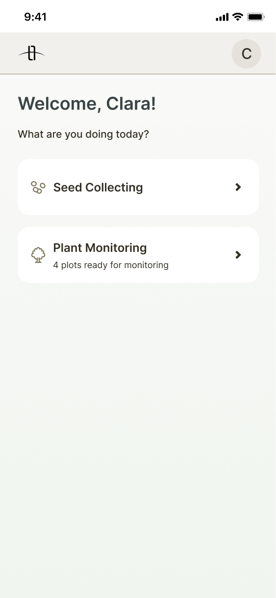
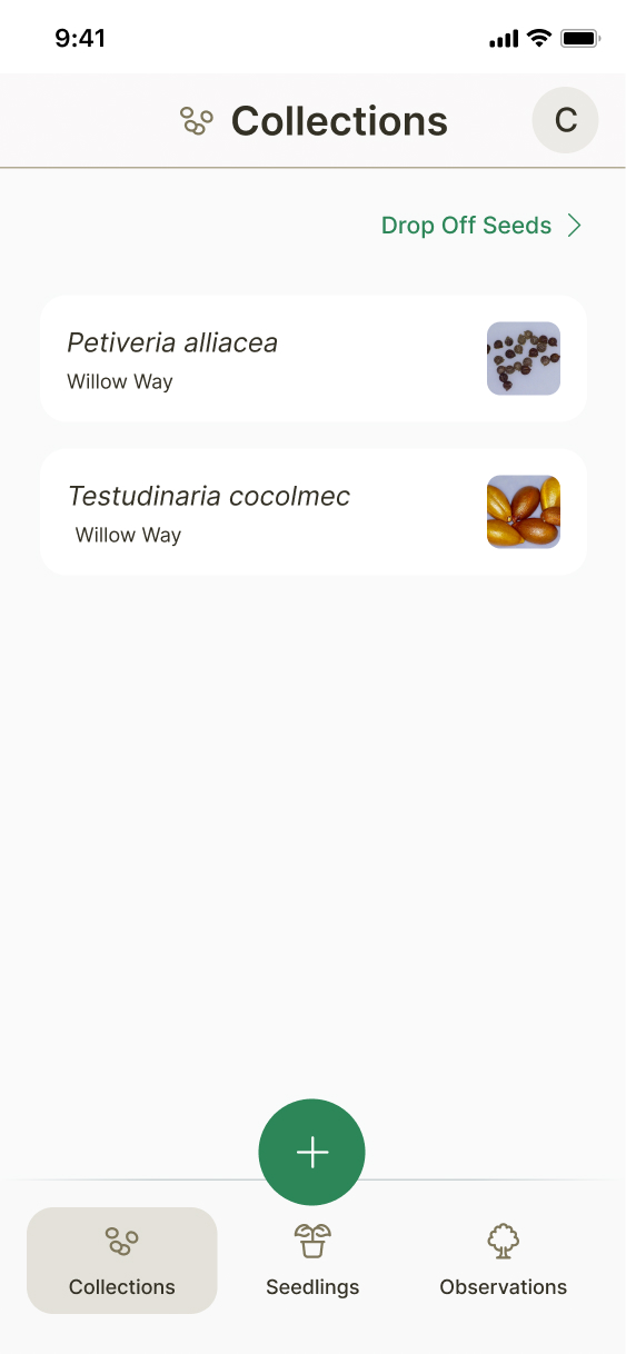
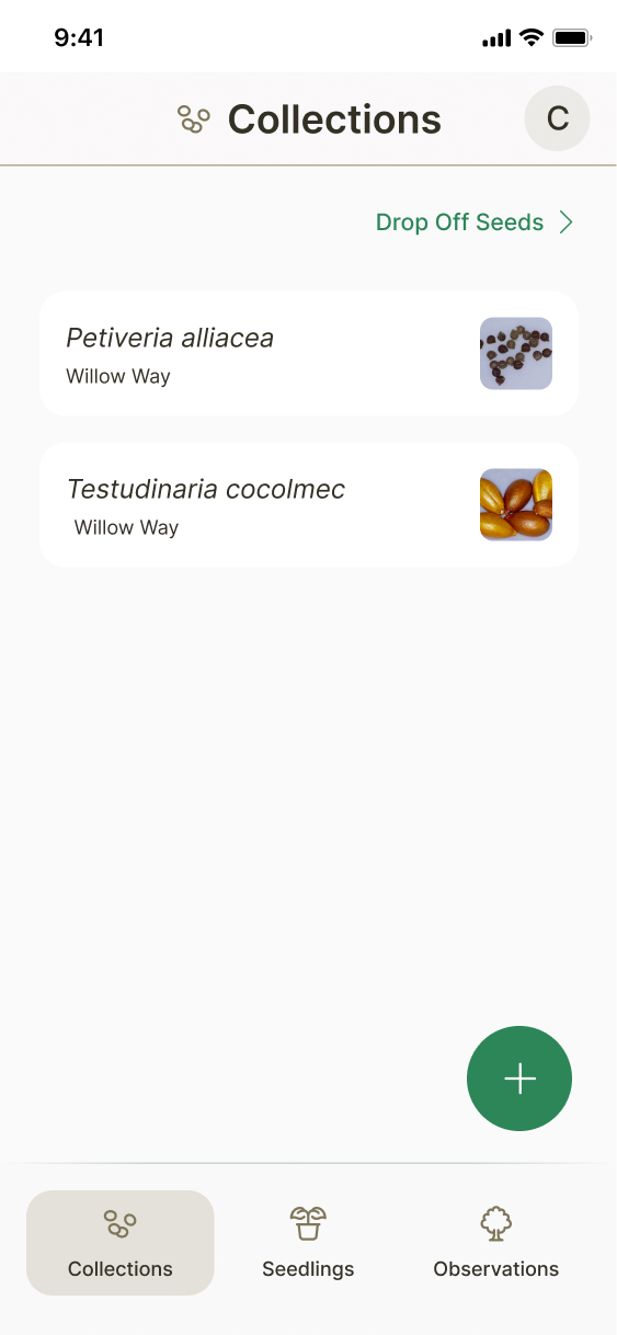
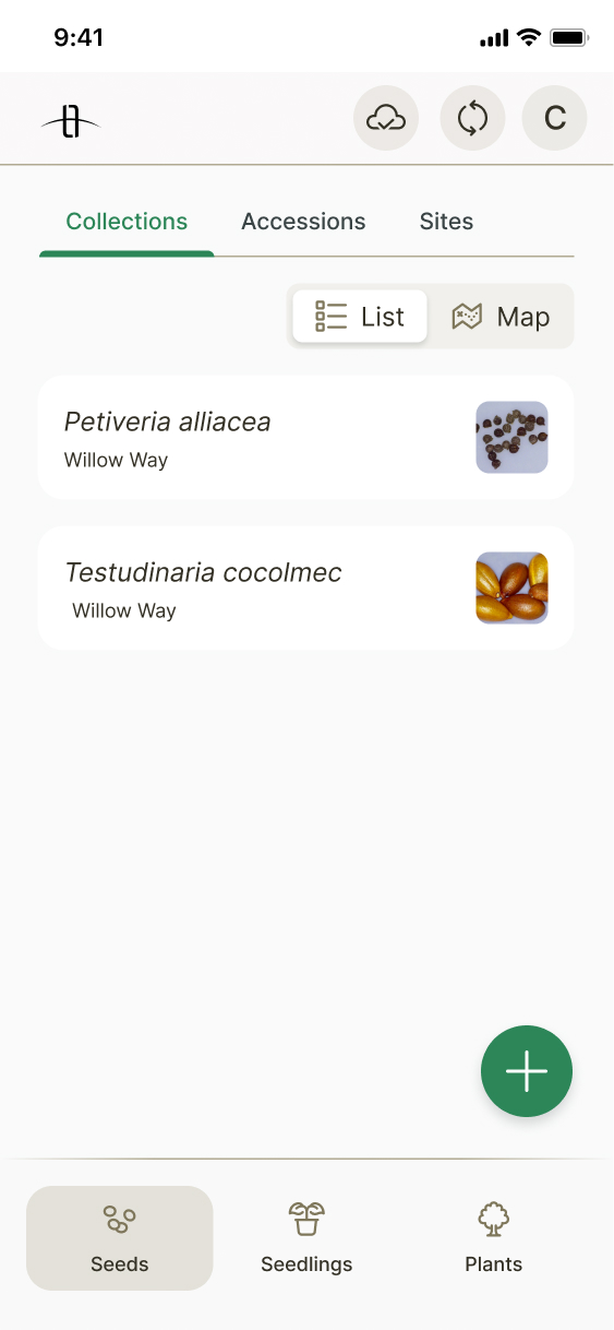
New scalable app architecture
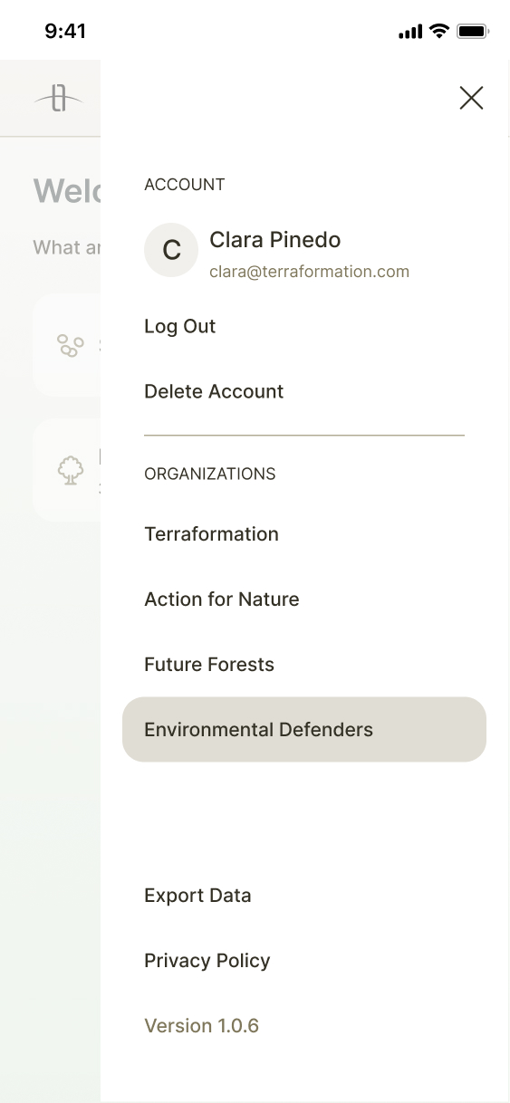
I explored various UI patterns for multiple features, including tabs, mini apps, and a new menu, before settling on the best change for our architecture.
New UI: maps, overlaid instructions, and plot setup flow
I worked with a project manager and an engineer to define requirements and scope for map features, then designed a framework and components for them. I experimented with different patterns for overlaid views before creating copywriting, illustrations, UX, and UI for the plot setup flow.
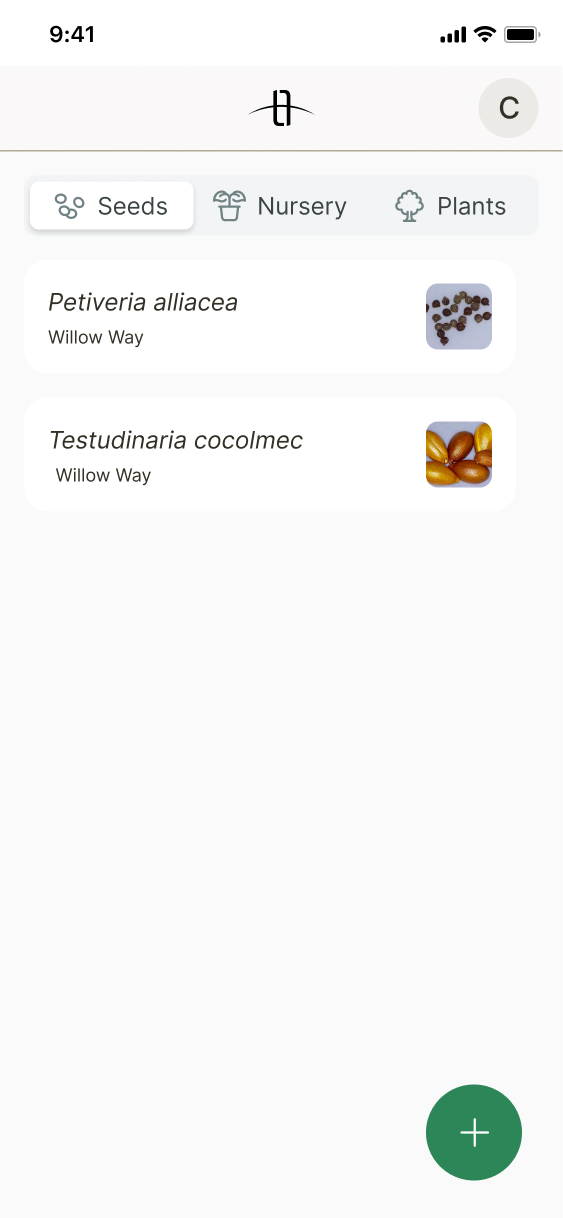
Old
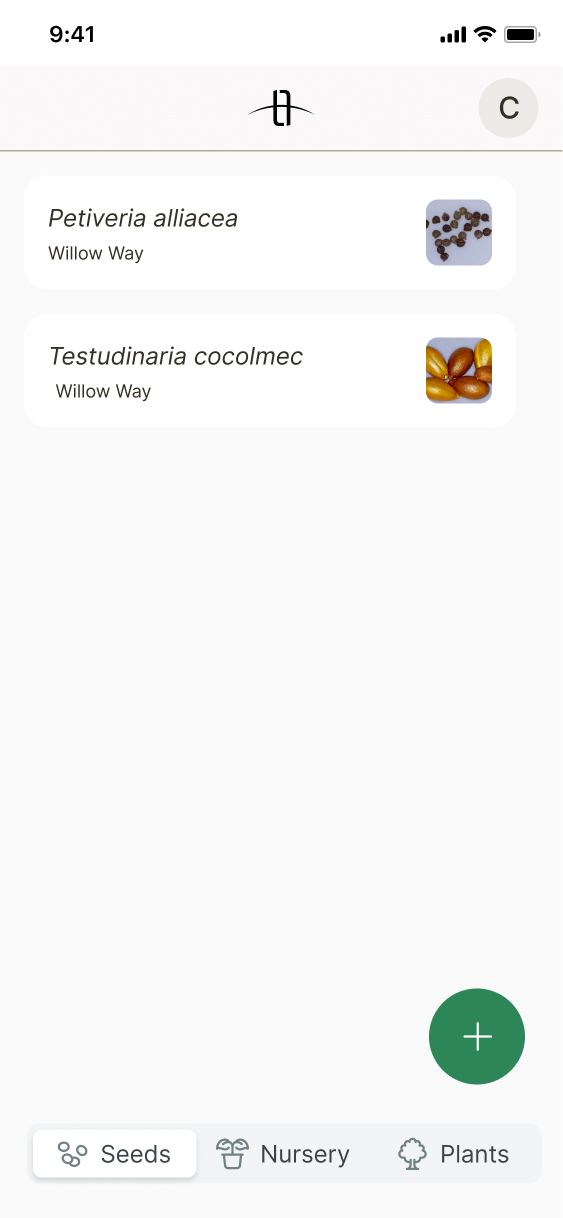
New
Process
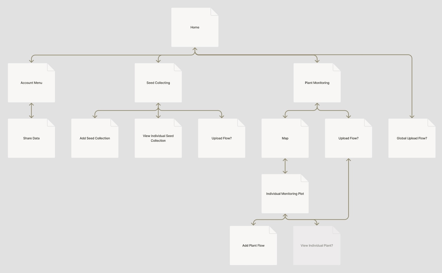
Architecture Mapping
To start off, I mapped out the intended architecture of the app, based on the mvp and existing features. I also thought about where different features or UI elements might exist on the mobile interface.
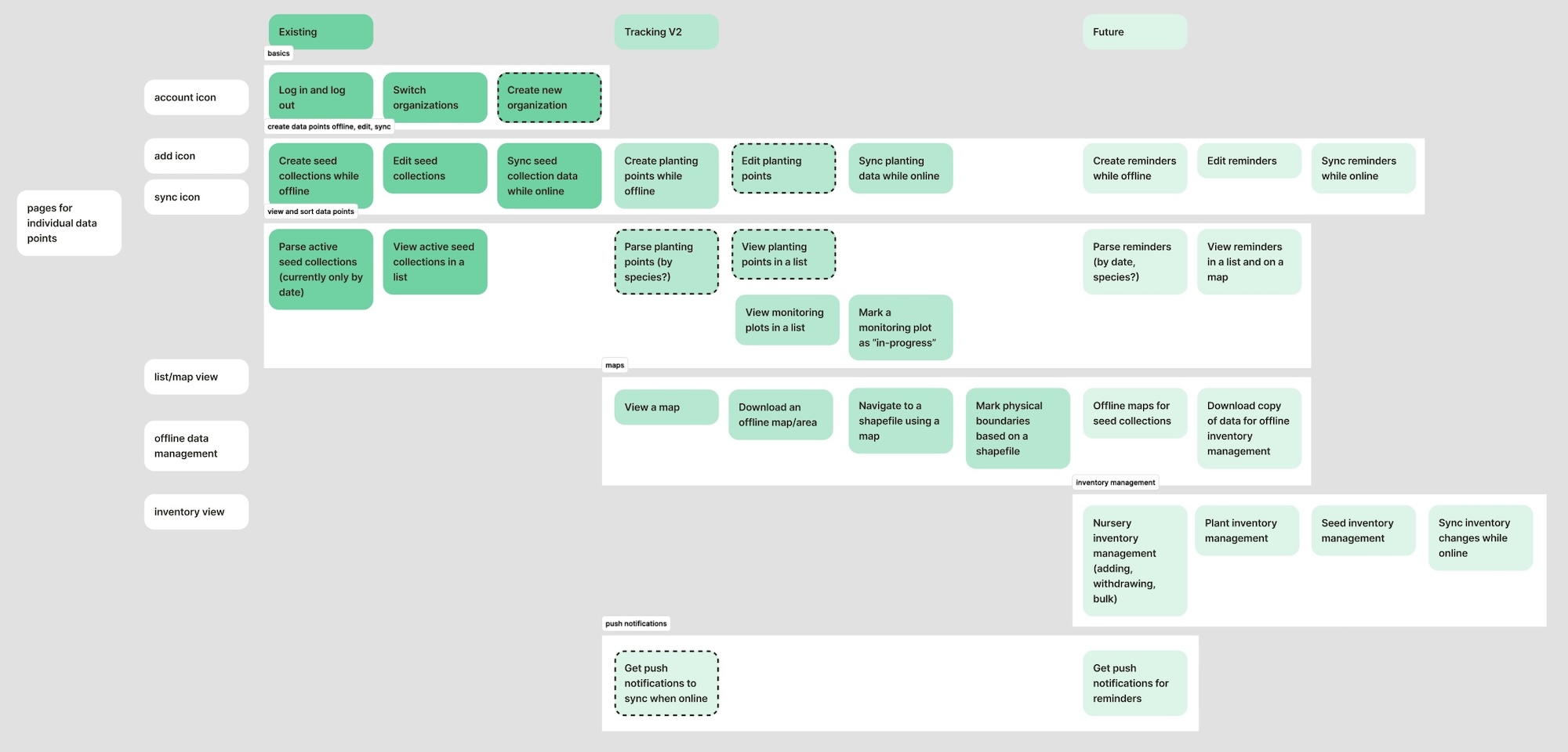
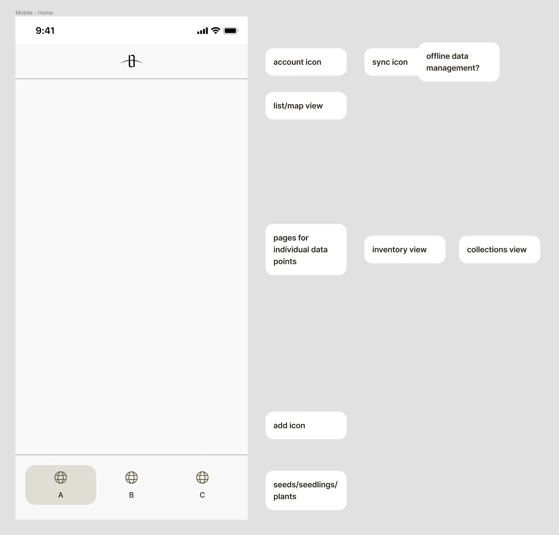
Architecture UI Exploration
I then moved on to exploring different visual approaches to the new architecture. One of the main questions I was trying to solve for was if uploading data should be global, or flow-specific. I created explorations for both and referenced them when discussing with others to assess scope.
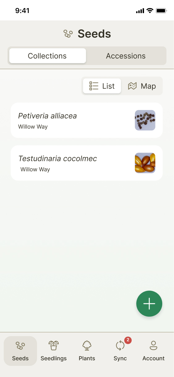
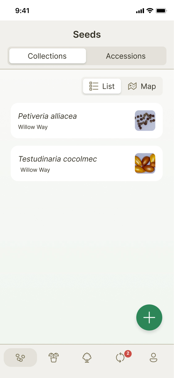
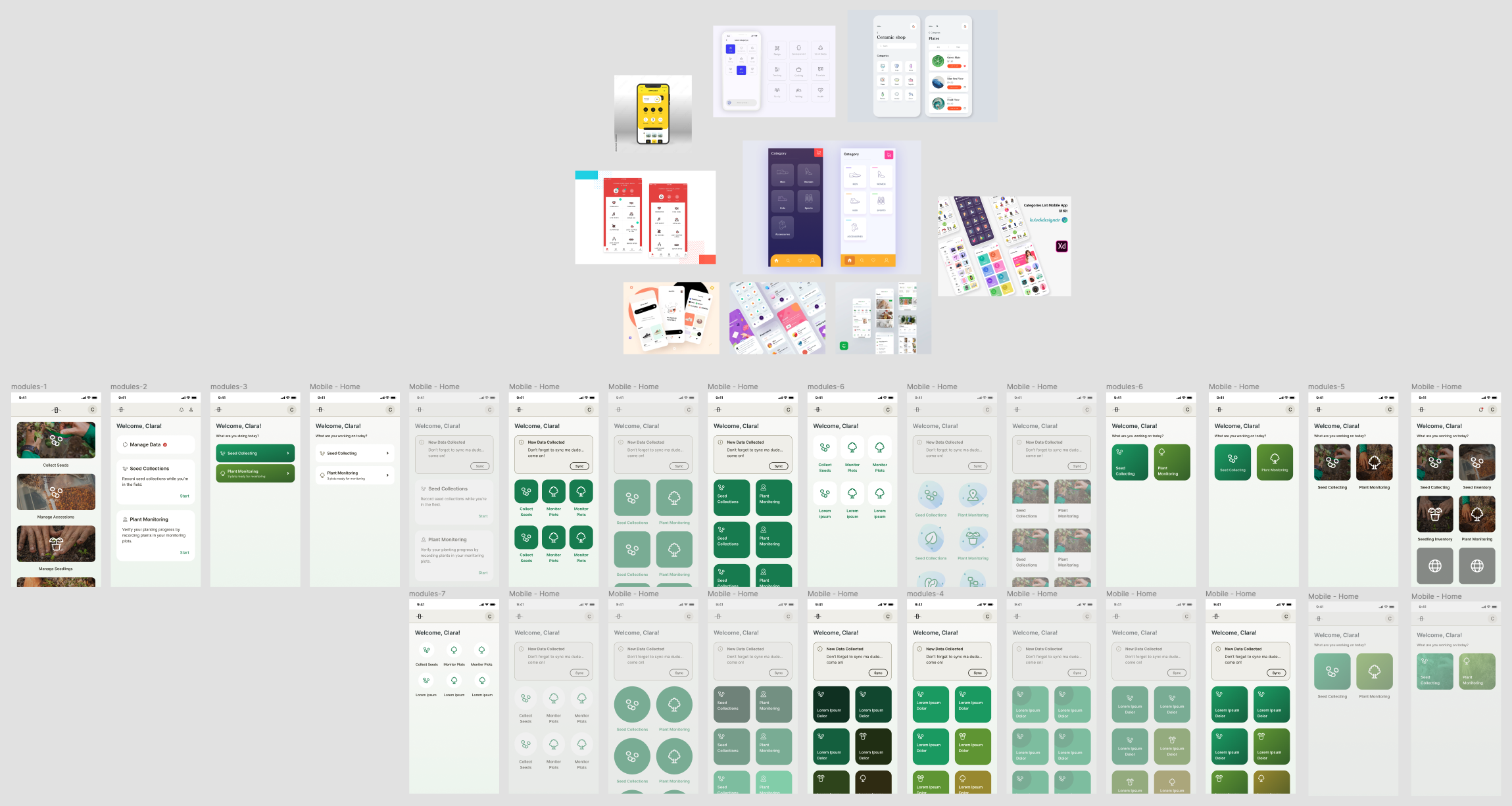
Final Architecture UI
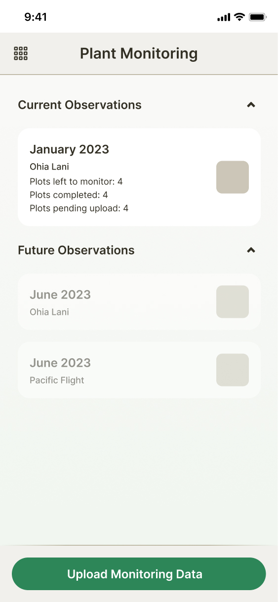
After feedback, I landed on this design as the most scalable and user friendly. Though people responded well to the color coding, black and white read better in the field, where bright sunlight can make it hard to differentiate colors. We also decided to keep uploads as flow-specific; it made more sense to wait to develope a global upload when or if we added more features.
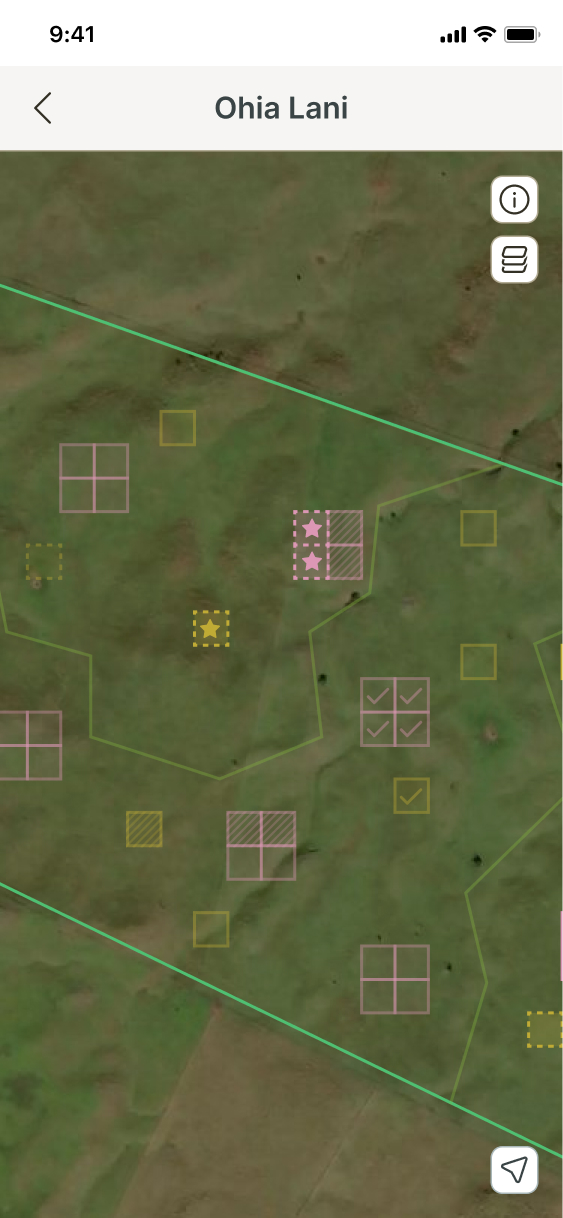
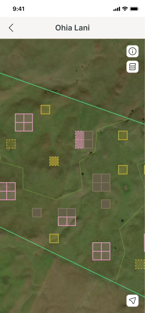
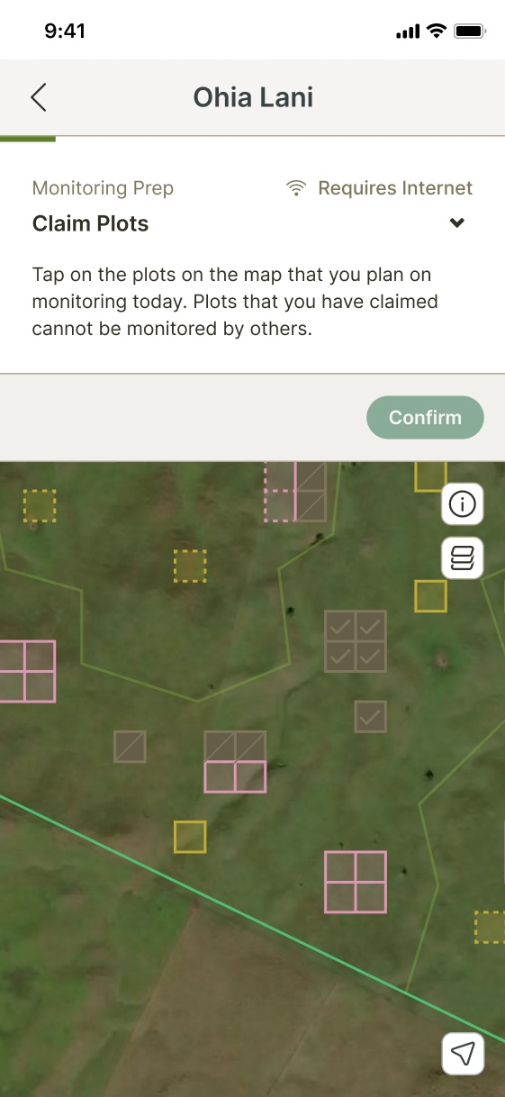
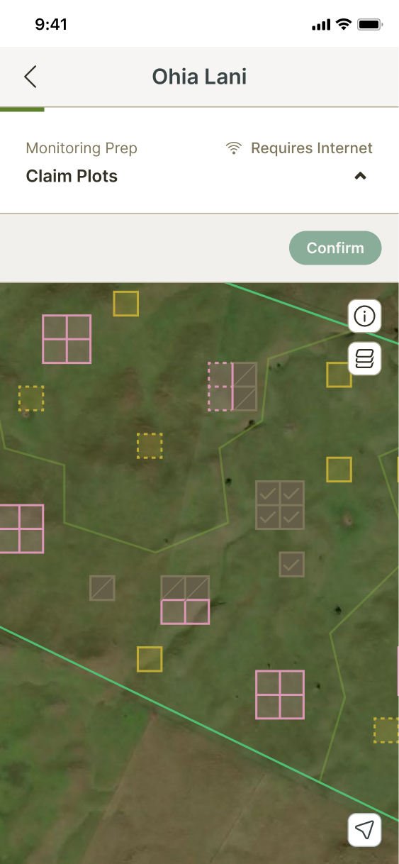
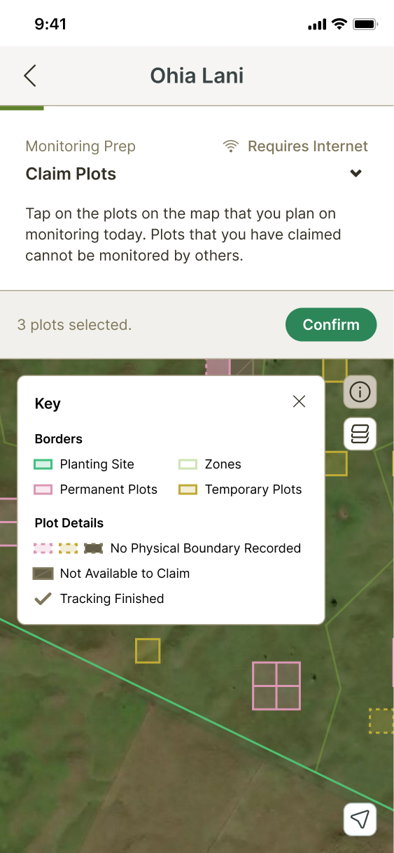
Map UI Exploration
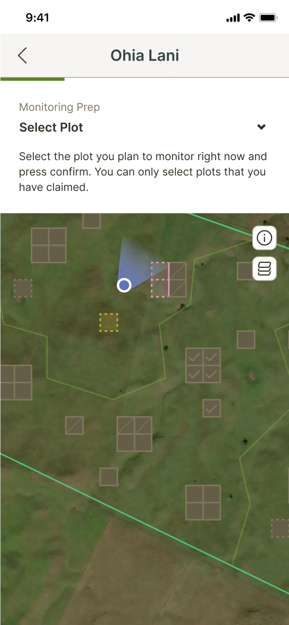
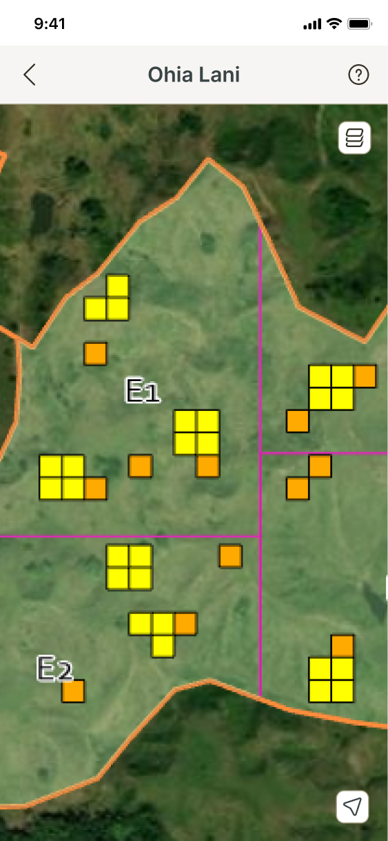
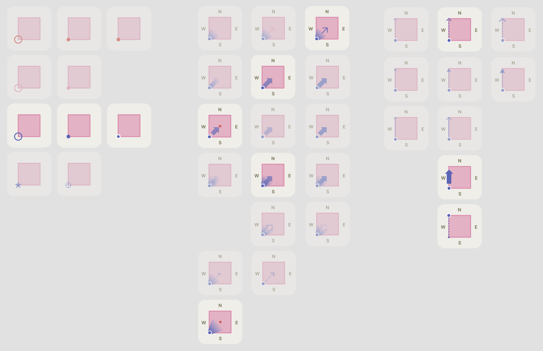
Before starting to explore the actual boundary setup flow, I first explored UI elements that would be necessary for it, such as map features (a key, layers, your location), messaging and popover UI, visual indicators for plot status, and visual language and symbols that could be used in instructional illustrations.

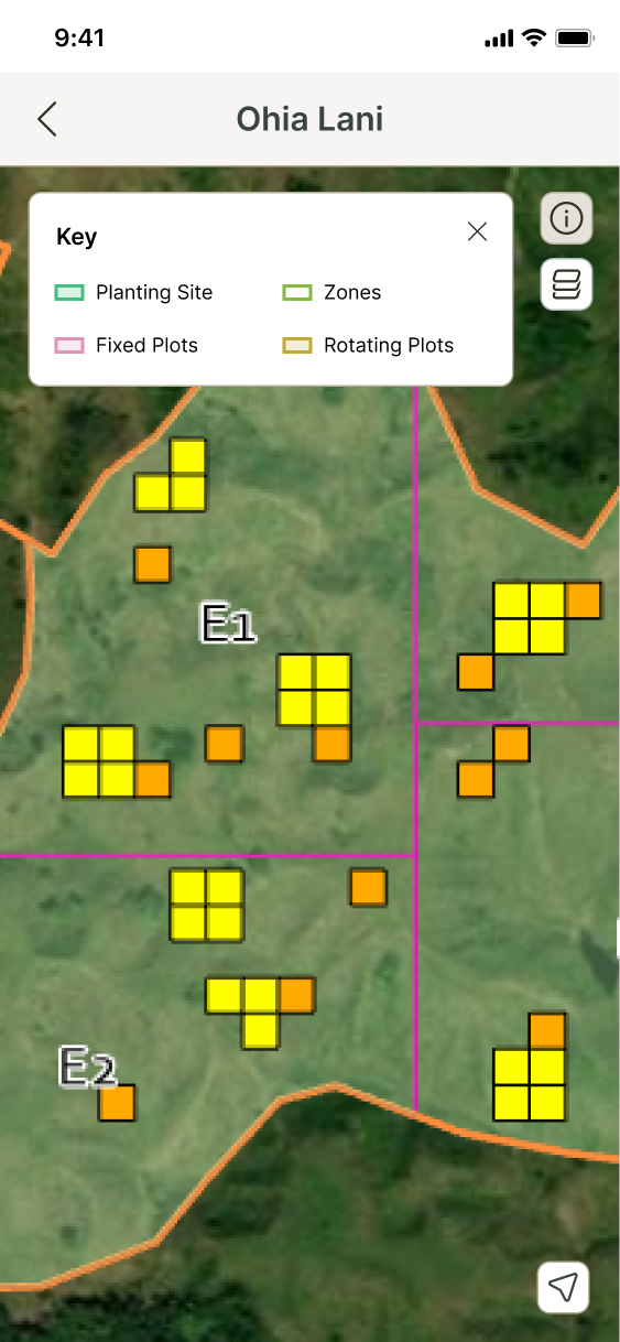
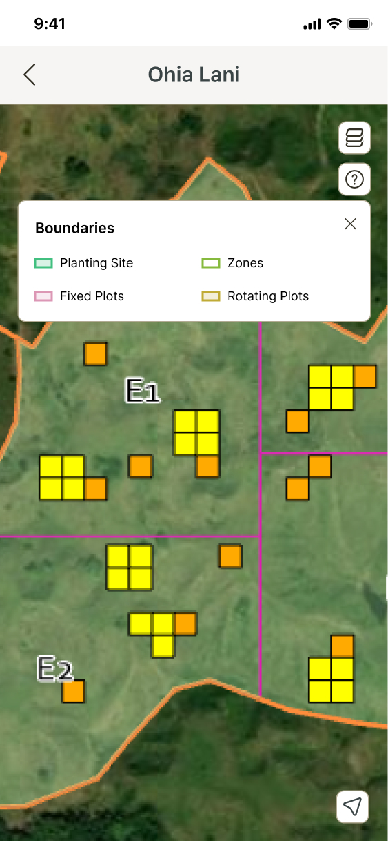
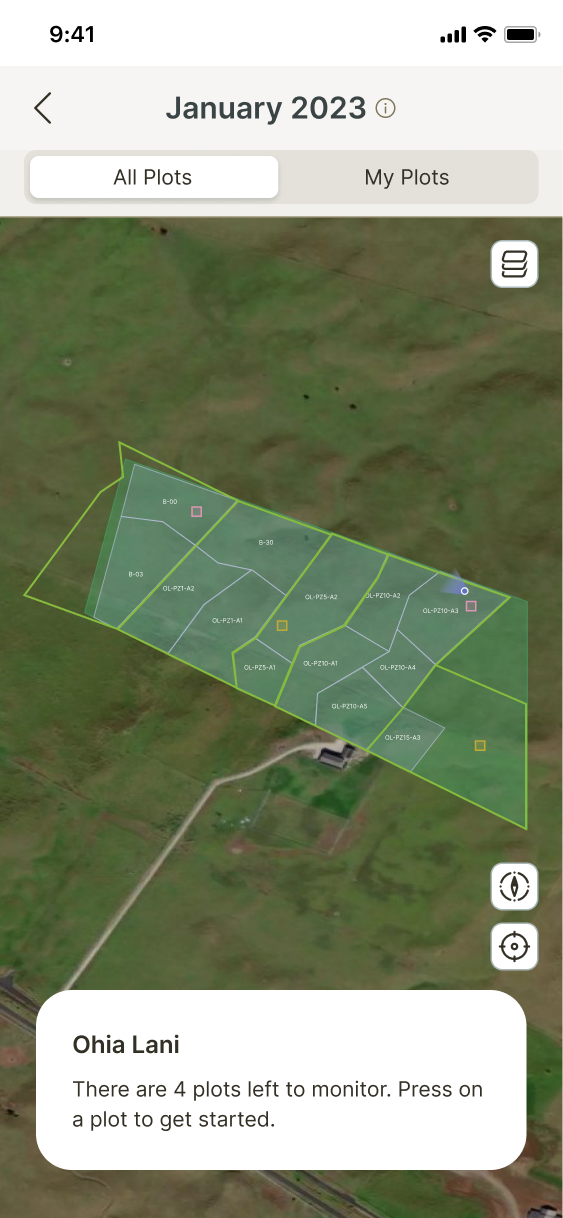
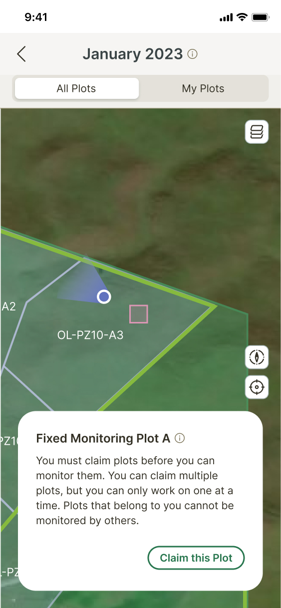

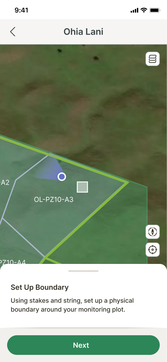
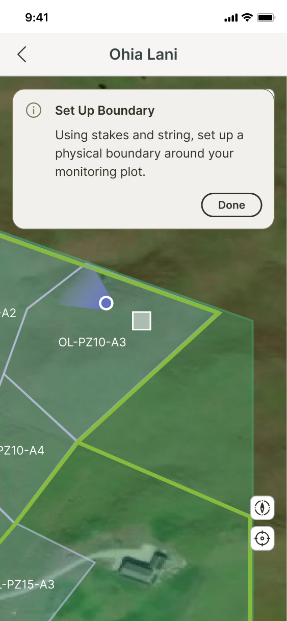
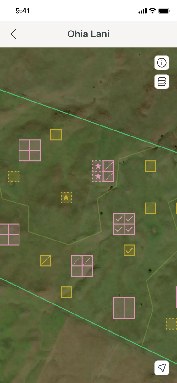
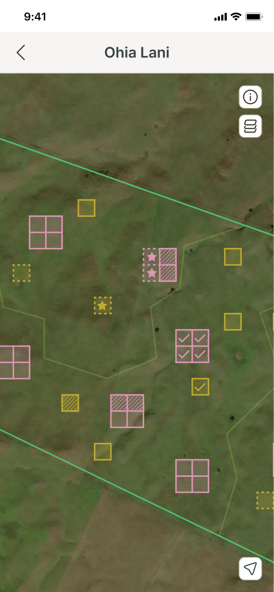

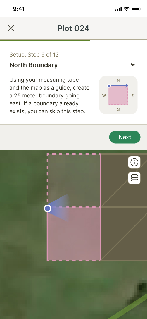
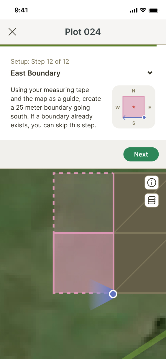
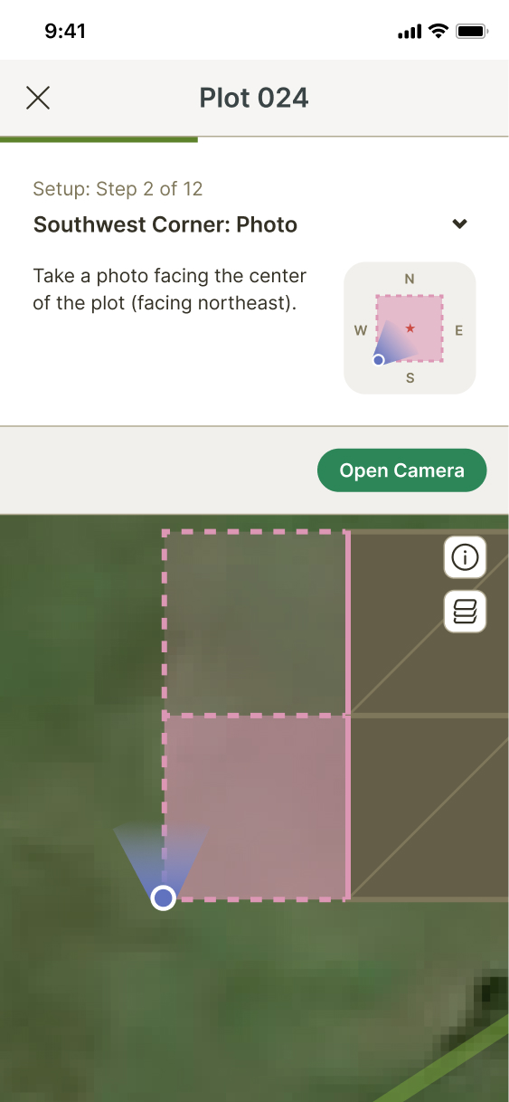
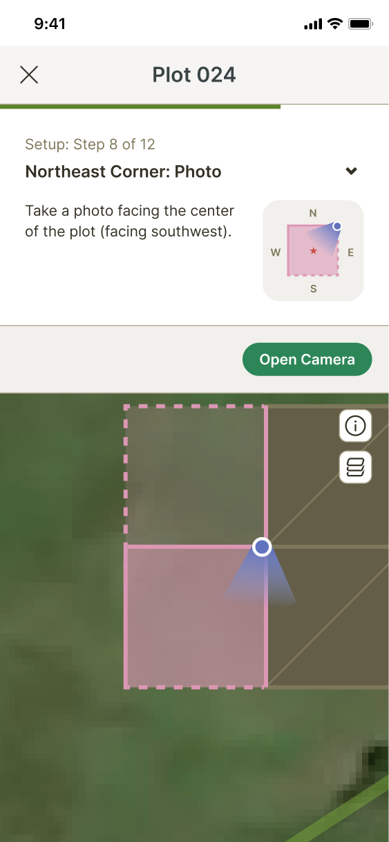
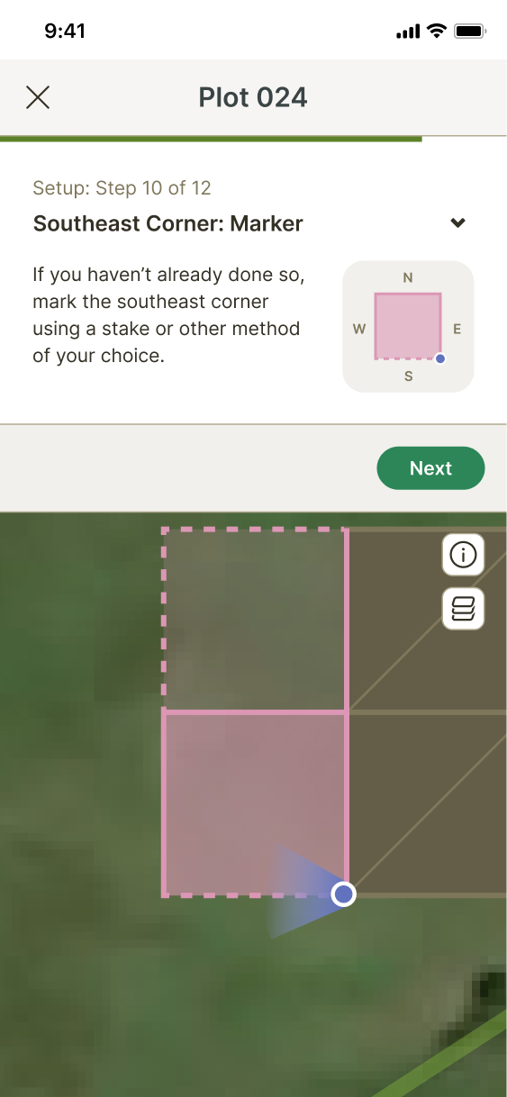
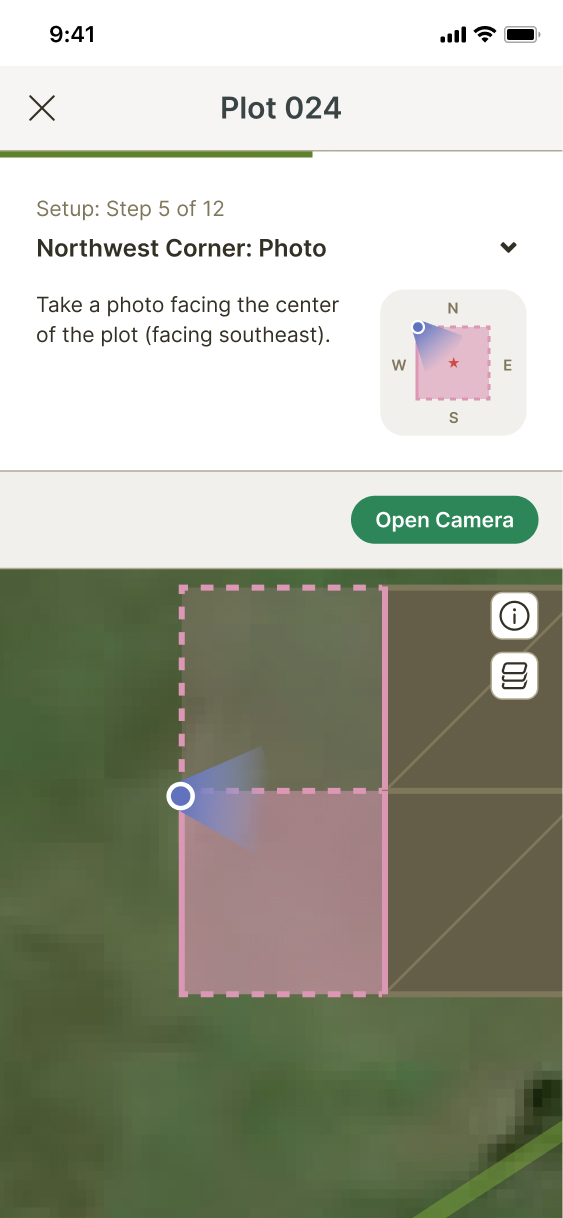
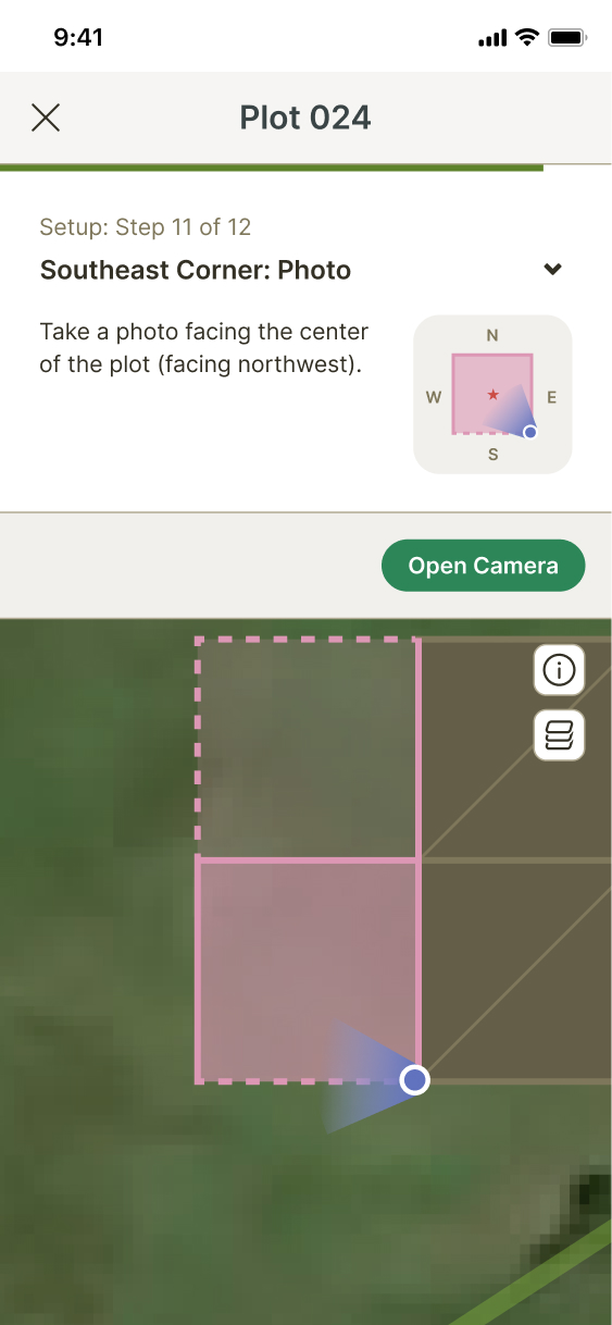
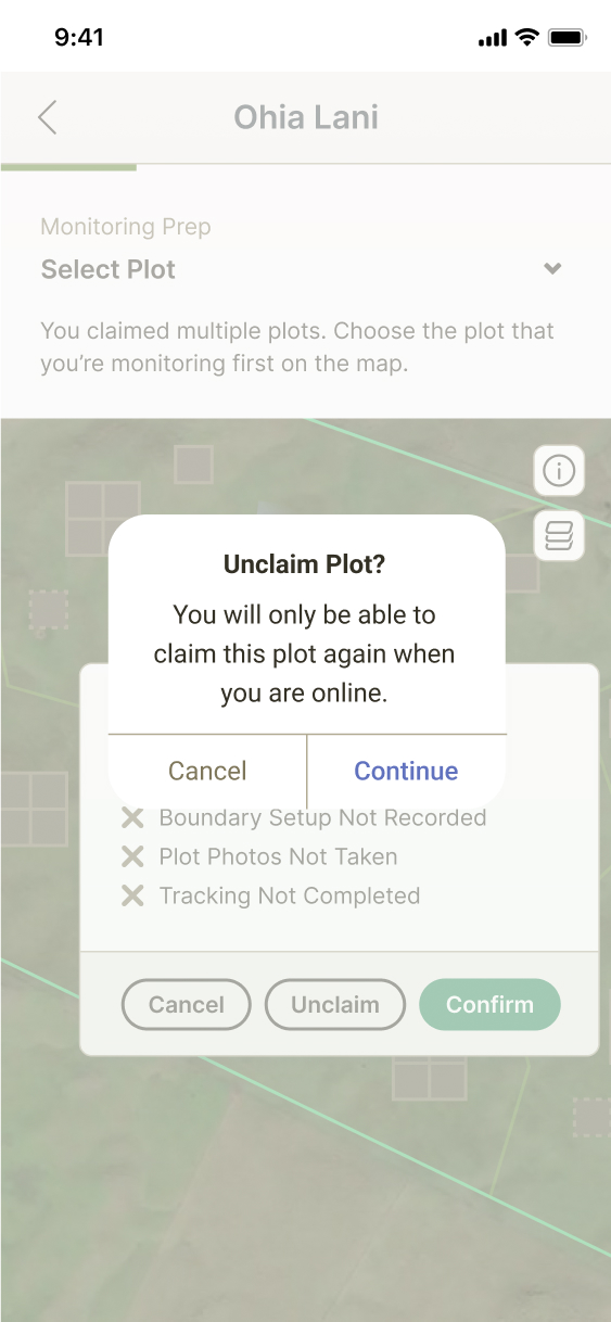
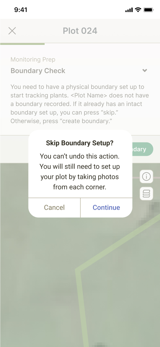
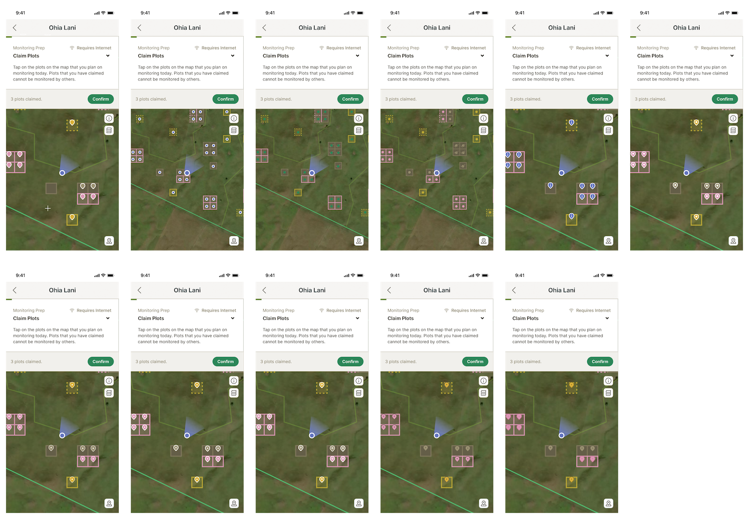
Plot Setup Flow
I settled on final visual directions based on feedback on my explorations and created the first draft of the plot setup flow. I had been briefed on the steps that the flow should follow and the reasoning behind each of them, but since I wasn't provided any text, I ended up doing all of the copywriting myself.
Updates & Fast Follows
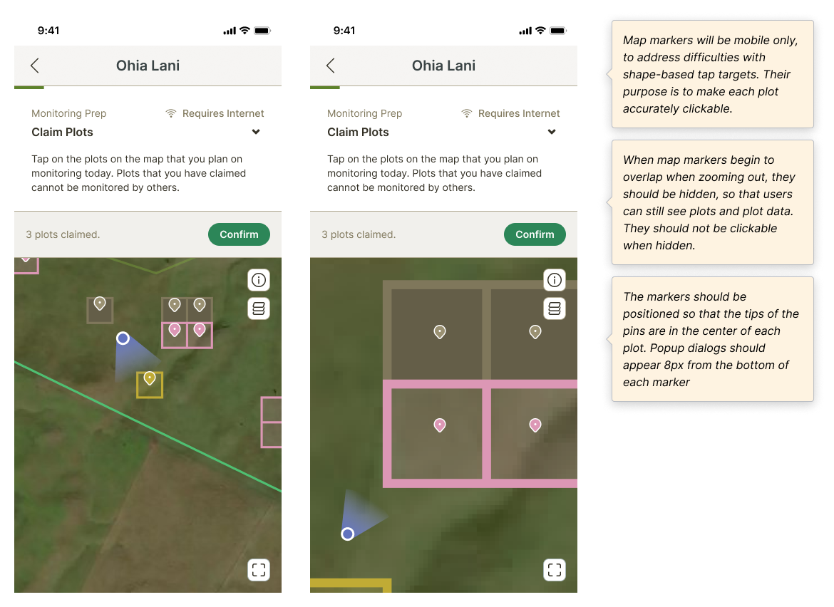
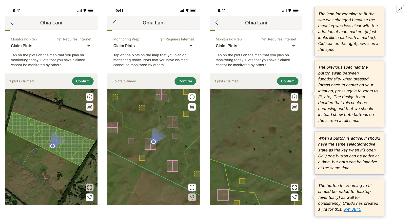
After additional feedback from both other designers and Josh, our mobile engineer, I added some updates to some functionality; for example, the code library that Josh was using required the use of tappable "markers" for each clickable shape, so I created new assets for them.
Exploration
New
Learnings
Sometimes simple is best.
I explored many different directions for app architecture, but the design that was settled on after discussion was one that was very simple. Though I tend to favor "aesthetic" designs that feel more visually appealing, simpler designs can often be better options for UX due to their clarity.
Users who aren't tech savvy won't understand UI patterns that we take for common knowledge.
Many of Terraformation's users are forestry field workers who aren't very tech savvy, which is why I ended up scrapping the explorations for popover messaging that involved cards. Though the goal was to have users swipe the card up and down to hide and show the instructions as they wished, we wouldn't have known if they would have understood that UI pattern without user testing, which we unfortunately didn't have the resources for at the time.