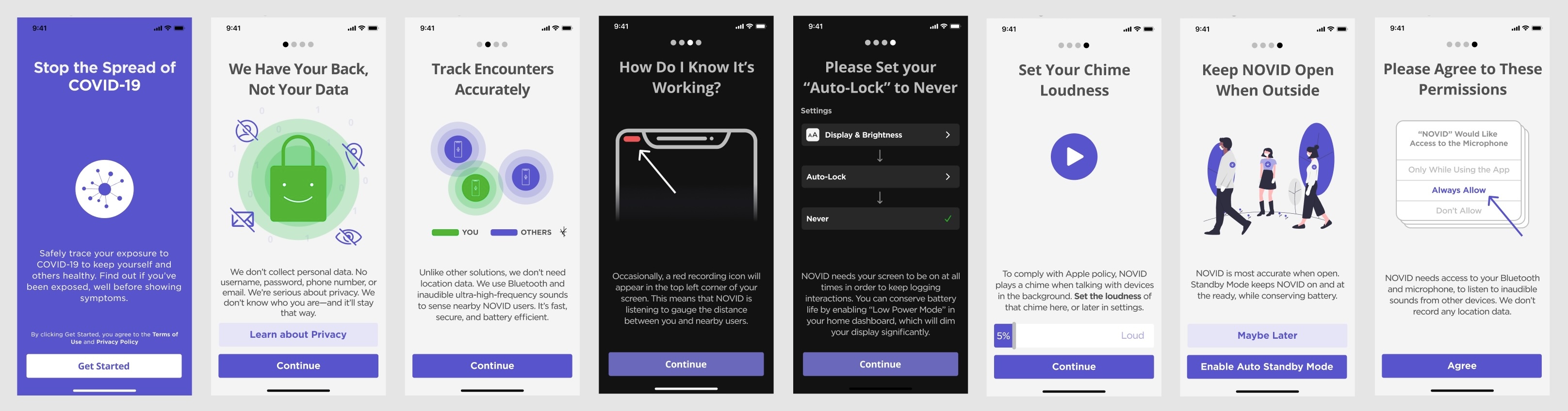
Problem
Users aren't enabling permissions.
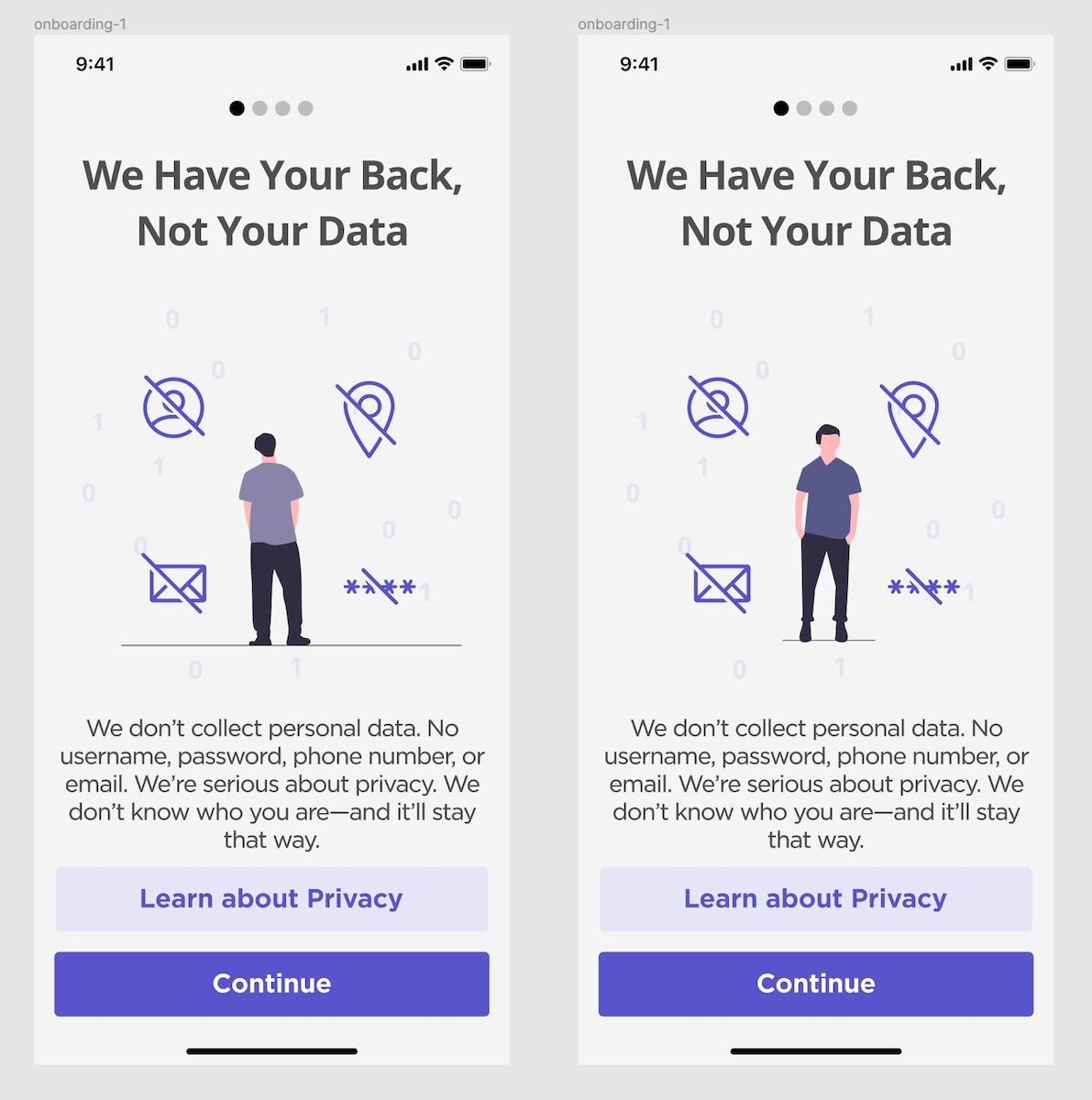
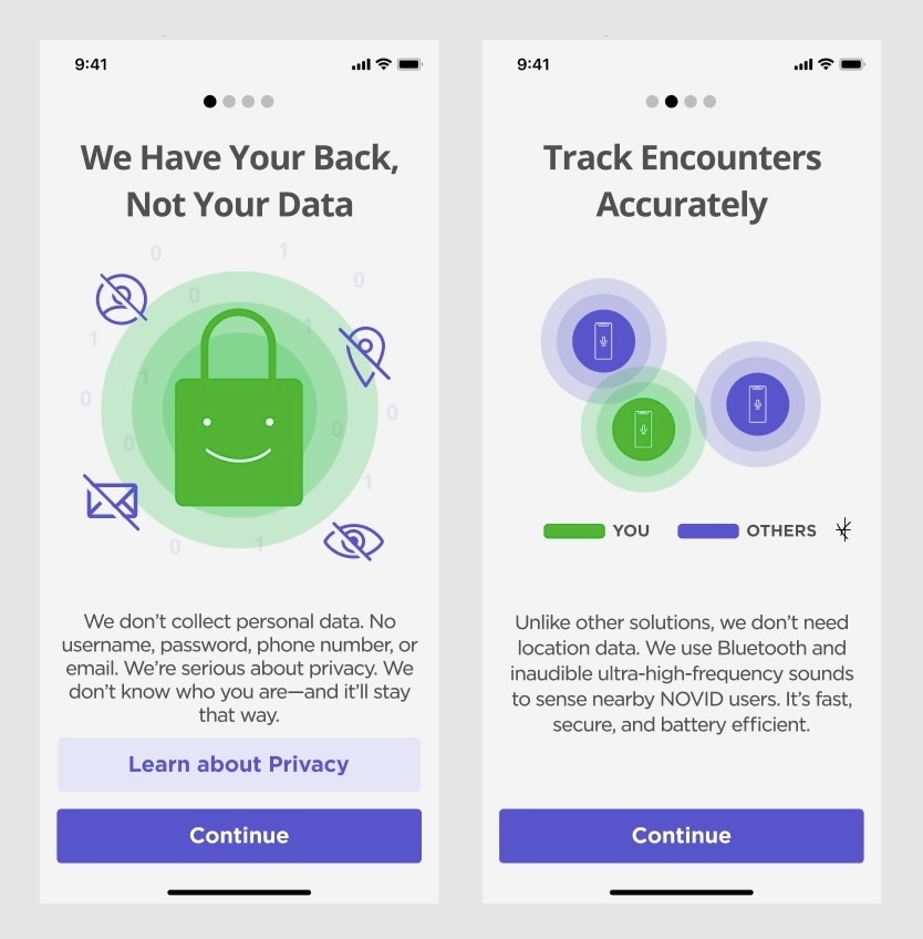
NOVID is a mobile contact tracing app that uses bluetooth, microphone, and wifi to track user interactions. In order for the app to function, users need to enable permissions while onboarding. However, many users were confused why they needed to enable specific permissions, or were uncomfortable enabling them.
Solution
Using motion to better explain concepts
Motion is a powerful tool for communicating ideas quickly and effectively. I was tasked with animating select onboarding illustrations in order to make them clearer and more compelling.
Revised content, for transparency
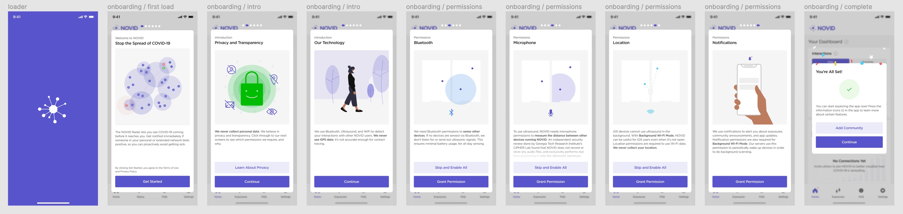
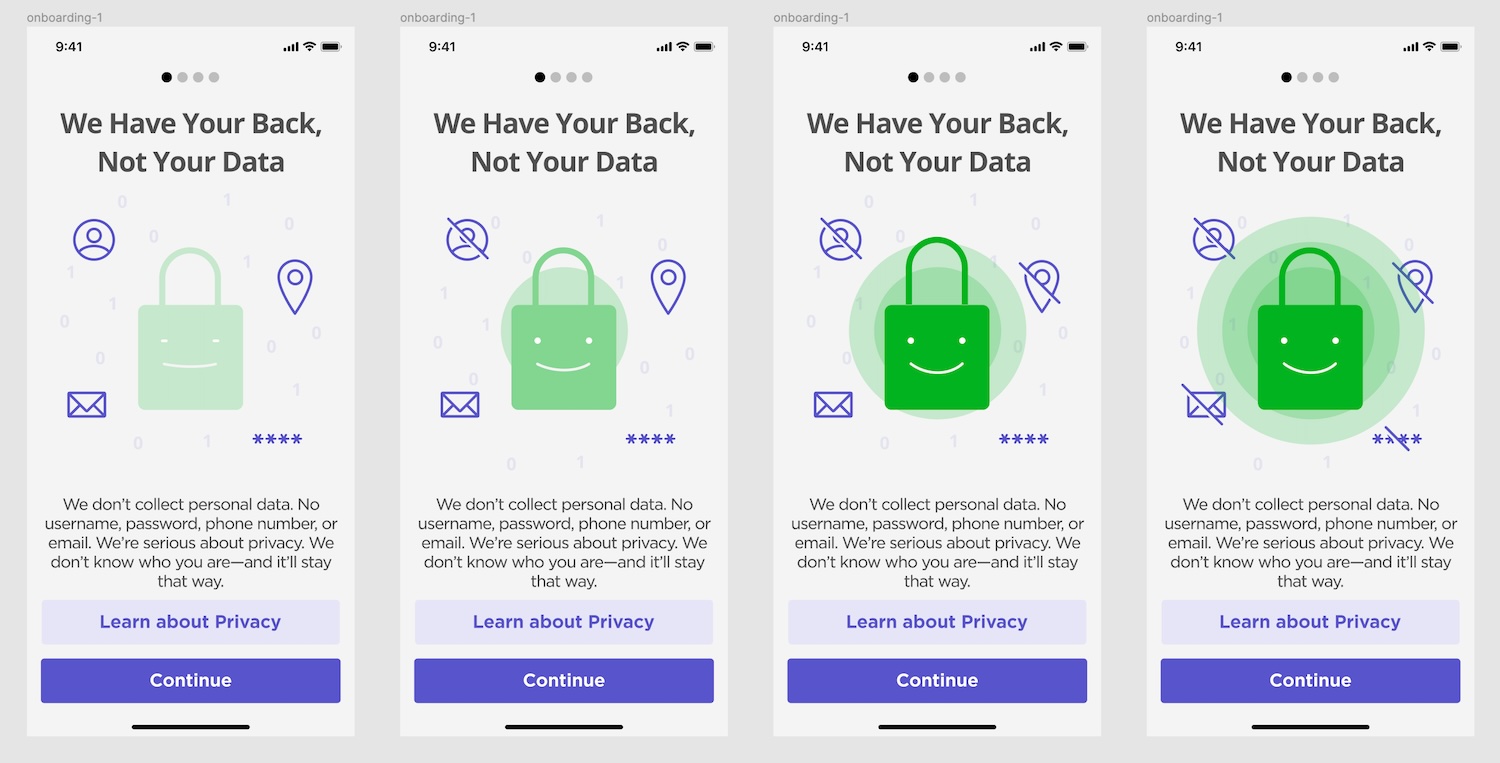
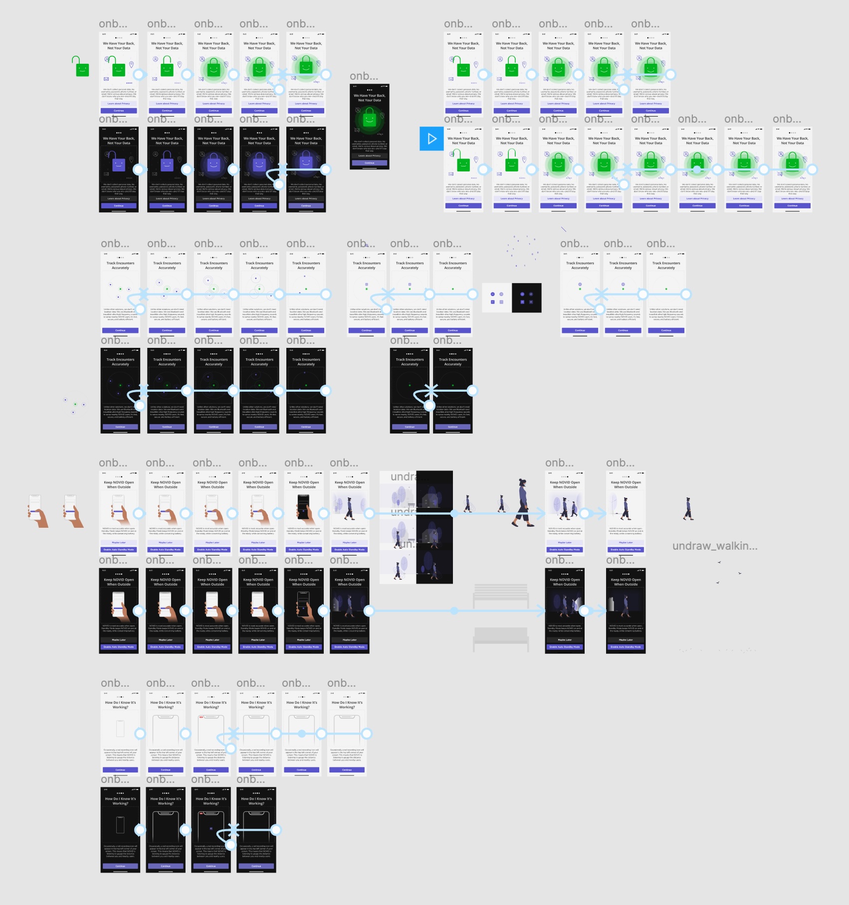
When we later started implementing the design system, I took the chance to re-design the layout and content of the onboarding flow. For full transparency, I split each of the permissions into separate onboarding screens and created new animations for them.
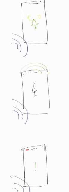
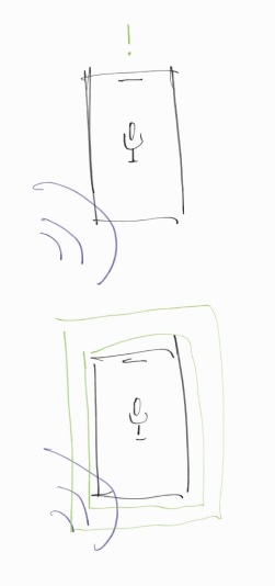
Old
New
Process
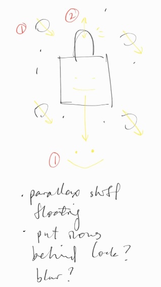
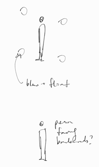
Initial Sketches
After getting context on the concepts, I started by storyboarding possible sequences for each animation with simple sketches.
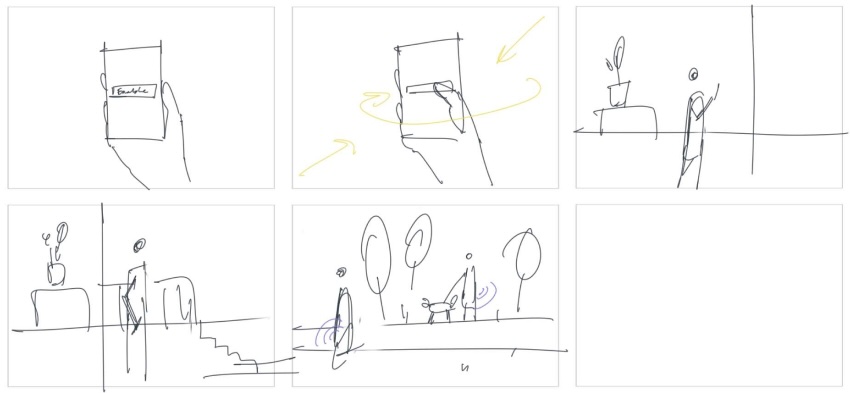
Hi-fi Storyboards
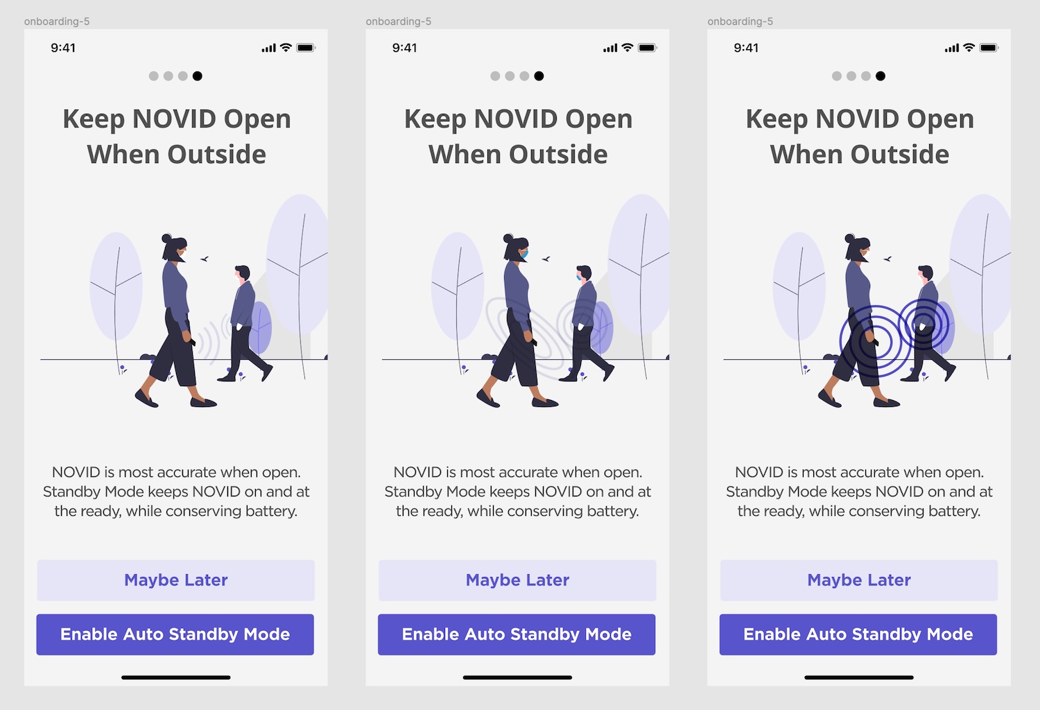
I then iterated on hi-fi storyboards based on my sketches. Many of the existing assets were from UnDraw, which I continued to pull from; I did some illustration when I couldn't find quality assets (eg. I created the hand asset).
Iterating with Prototypes
After narrowing down visuals for each concept, I started testing motion using prototypes and auto-animate. This way, I could iterate on easing and timing quickly, as well as easily get feedback from others by using prototype links.
Rendering in After Effects
To create the final assets, I plugged everything into After Effects, then added final details and complex animations (eg. the walk cycle). The final files were handed off to developers as Lottie .json files.
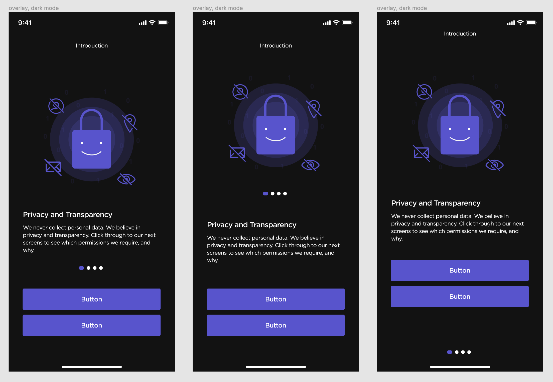
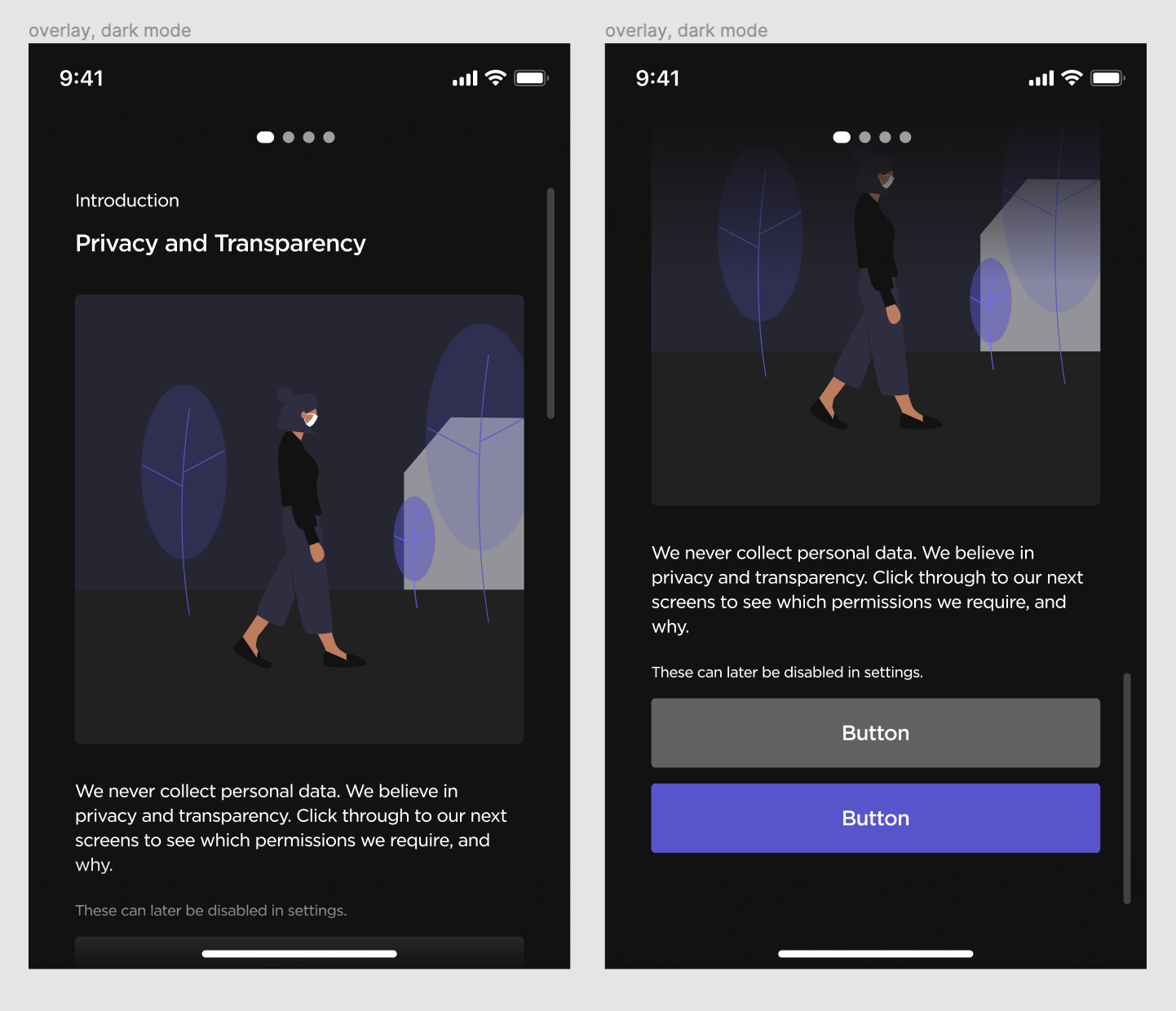
Layout Exploration
When we later started applying new design system styles, I had the chance to reconsider the onboarding screens; we didn't yet have a component for them. I ultimately decided on a pop-up modal since it reduced the amount of scrolling users would have to do to read descriptions, gave users a peek of our interface, and could become a re-usable component.
Old
Exploration
New
Content Expansion
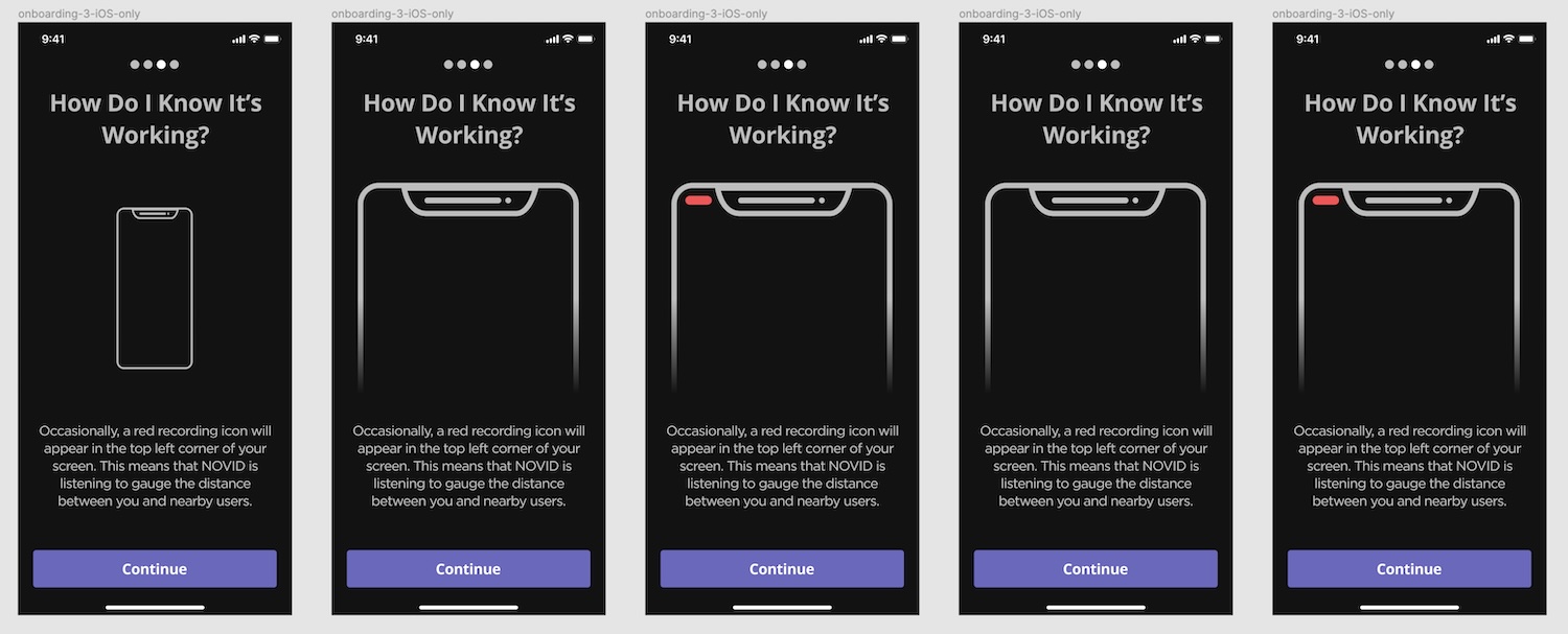
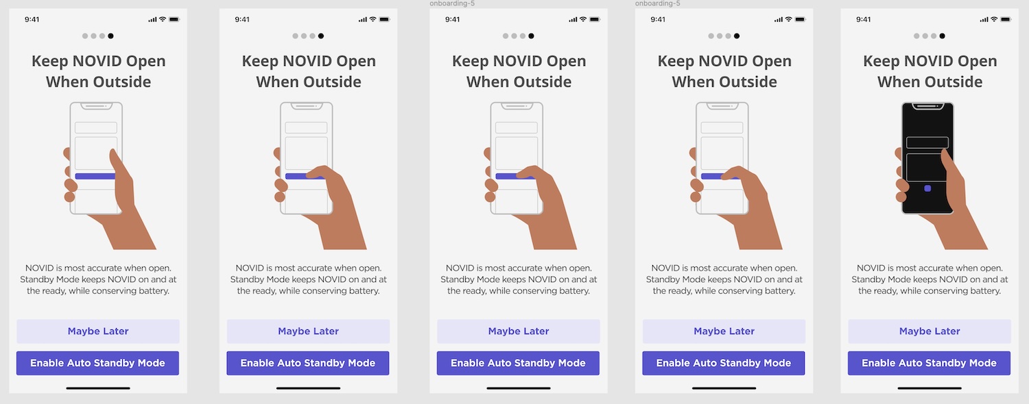
To further address user distrust surrounding our permissions, I also expanded the flow, dedicating one screen to each permission to explain why it was needed. I did a good amount of copywriting here, and also created new animations to accompany the new content.
Learnings
Motion is fun!
This is probably the most animation-intensive project I've done, and I really enjoyed the process. There's a special delight I find in clean snappy motion that I don't really find elsewhere.
It's hard to measure impact with no user heuristics.
At the time, the team was tracking some clicks and user activity, but didn't have a system or the bandwidth to measuring statistics like user retention. So unfortunately, I was unable to quantify if user trust actually increased or not as a result of my contributions. I hope to be able to learn more about measuring impact in future projects.